Responsive web design is no longer a new development. This type of site saves every business owner money. With this type of web design work, we are able to make websites that will work in all types of browsers. Now nobody wants or needs a second seperate mobile site. For us there is no other option; we only offer responsive web design to our clients.

So many people are switching away from old clunky desktop computers. Even laptop computers are becoming yesterday’s news. We are seeing explosive growth in tablet and smartphone sales. On the other hand, computer sales decline year after year. So now we have a huge increase in tablet and smartphone sales. Athe same time computer sales seem to be in a free-fall. Consequently, it may seem counter-intuitive for us to insist that you no longer need a mobile web design. What we mean is that you don’t need one website for computer users and a second website for mobile device users.

We insist on providing you with a responsive web design. This is the only way that the website will automatically change its shape to fit whatever device is being used. Remember the old monitor where you could see the separate red, blue and green pixels? Those days are gone and they aren’t coming back!

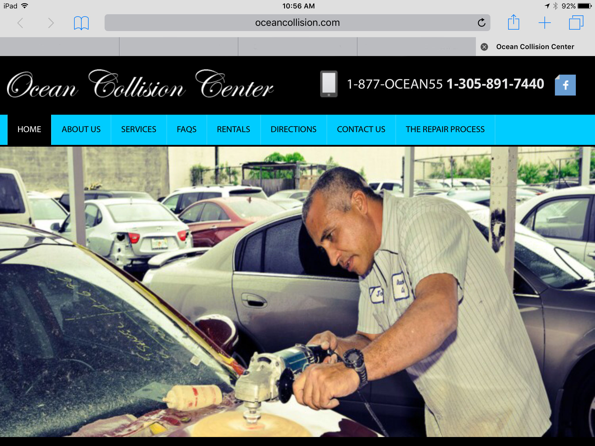
Responsive Web Design

responsive web designThe iPad with a Retina® Display has so many pixels per inch that the human eye can no longer detect them. A properly designed responsive website will display differently on every device and will work well on all devices. This type of web design will work on Android phones and tablets, Apple phones and iPads as well as laptop computers and desktop computers. This is the reason that we no longer offer mobile web design as a separate project.

When we create your new web design project we test it in different computers, tablets and smart phones. We also test your new website in different browsers. We want to make certain that 100% of your potential customers can view your website without any problems.

An ecommerce web design project requires extra care. There are things you can do on a computer with a mouse that will be very different on a smart phone. We check everything to be sure the shopping experience is easy to navigate no matter what device your potential customer may be using.

Ecommerce & CMS web design should all be responsive web design

Here is an example of a website that looks one way on a computer and an entirely different way on a tablet or smart phone.

ipad-version
iphone_screen